Envirometer for museums
This page shows the environmental impact of the average museum based on Envirometer graphs and key figures.
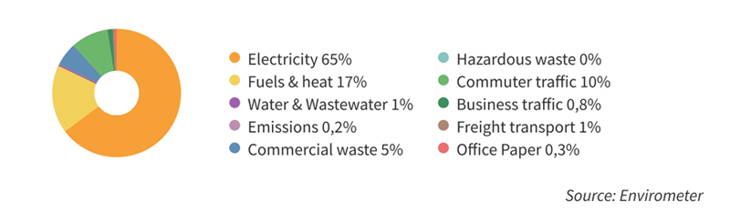
The pie chart shows the environmental impact distribution. Electricity clearly has the greatest environmental impact, followed by heating (fuels) and commuter traffic.
Key figures
The tables below show several key figures from the museum benchmark. We have provided the average and the range (second to lowest and second to highest values).
| Environmental aspect | Key figure | Average | Range | Unit |
| Electricity | electricity / surface area | 108 | 37 – 162 | kWh/m2 |
| |
electricity / employee | 3,0 | 1,3 – 25 | kWh/FTE |
| |
building-related energy / floor area | 1,2 | 0,5 – 2,1 | GJ/m2 |
| Fuel | gas eq. / building contents | 2,6 | 1,1 – 5,4 | m3 gas eq./m3* |
| Water | water / visitor** | 11 | 6- 27 | litres/visitor |
| Waste | waste / visitor | 200 | 20 – 1000 | grams/visitor |
| |
waste separation percentage | 50 | 21 – 76 | % |
| CO2-footprint | CO2-emission / employee | 2,4 | 1 – 12 | kg CO2/visitor |
* For ‘fuel’, the use of city heat was converted into natural gas equivalents.
** Water use in a museum is determined by the number of toilet flushes (6-12 litres) and by air humidification.
Source of this average Envirometer
In 2016/2017, fourteen museums of which eight from the Sustainability Circle Hague Museums completed an Envirometer. Stimular used these to calculate an average environmental score for museums. Compared to the average environmental score of 2012, the key figures of electricity, water and waste decreased. The new commuter traffic is a lot higher (due to the changed group composition).